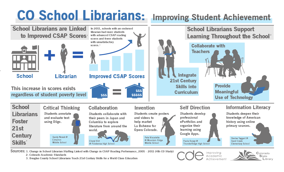
Linda Hofschire knew something had to be done. An analyst at Library Research Service at Colorado State Library (CSL), Hofschire says that her colleagues had been collecting school library impact studies since the early 1990s to assess the influence of school libraries on student test scores. By her own admission, these were thick, technical reports “full of lots of jargon.” But over the past few years, more and more of CSL’s constituents were asking for data that was more presentable—something they could show to their principals, administrators, and superintendents.
So Hofschire and her colleagues created a one-page legal-size infographic that summed up more than two decades of data. While it was only a general snapshot, she says, “This was the piece that our users needed to start that conversation with their stakeholders.” And it had a tremendously positive impact.
That was three years ago.
On January 9 at the 2016 ALA Midwinter Meeting in Boston, Hofschire gave a well-attended presentation called “Data Visualization for the Rest of Us: A Beginner’s Guide.” There she talked about how CSL has begun taking a more visual approach to presenting data.
Initially, CSL heard concerns from people, asking whether the data was being dumbed down or merely made pretty. But she says the opposite is true, because “a well-designed infographic actually makes numbers much more accessible to people, much more quickly.” Infographics can play a powerful role, she says, in making the story of a library more meaningful to stakeholders.
Hofschire provided attendees what she said were four simple tweaks to make numbers and charts more accessible:
- Put numbers in context. Throwing numbers out at people may seem vaguely impressive, but they’re still abstract. For example, instead of saying “more than 90% of Colorado public libraries help people find jobs,” it’s better to say “more than nine in 10.” Or use references to popular culture to help make numbers relatable. “Seven times as many libraries as Starbucks stores” is easier to visualize than “120,000 libraries.”
- Choose the appropriate chart. There are times when a bar graph, for example, will show meaningful distinctions better than a pie chart. The size of pie wedges and color differences may not be obvious and can become confusing. Hofschire also discourages the use of 3D charts of any kind, because they can make it harder to interpret the numbers accurately. “Just because Excel has something as a feature doesn’t mean you have to take advantage of it,” she advises.
- Simplify and establish a focal point. Pare the information you’re trying to present down to a manageable amount. “We know that people’s attention spans are fairly short, so unless you can get them to look at a graphic and make sense of it in a few seconds, you’ve lost them,” Hofschire says.
- Don’t make people work too hard to find information. A particularly common problem that Hofschire sees is missing components such as data labels that can help readers interpret what they’re seeing.
In terms of design, she offered several guidelines and gave tips on infographic creation software. For instance, she praised the “by the numbers” infographic in NYPL’s 2012 annual report for its clean, simple design. She also recommended that designers try to use only one font, and use color to help make a point, rather than simply using Excel’s default colors.
The takeaway, Hofschire says, is that you should dissect charts that your organization has already used and see how they can be improved. She also suggested taking a data inventory and thinking about what stories you want to tell. Do you have the data to tell these stories?
Slides of Hofschire’s presentation can be found at bit.ly/ALAMW_Data.