Librarian Jessica Lamarre hides a dark and shameful secret.
“The first flier I ever designed had a clip-art border,” confesses Lamarre, head of children’s services at Duxbury (Mass.) Free Library (DFL) and a freelance graphic design consultant. “I had no idea that that wasn’t the proper way to design an eye-catching flier.”
Pixelated photos, inappropriate font choices, and other design depravities—including, yes, clip art—often hamper libraries’ attempts to communicate effectively with their patrons. In an age when even preschoolers have access to desktop-publishing software, the public has become more sophisticated about what constitutes good design. And an amateurish poster slapped together over the course of a few minutes in Microsoft Word isn’t it.
“It’s so important, given all of the wonderful resources that we have, that we put forward the best visual representation of ourselves as libraries and librarians,” says Diana K. Wakimoto, associate librarian at California State University, East Bay, in Hayward and author of Easy Graphic Design for Librarians (ALA Editions, 2018). At the same time, she points out, “most of us who do graphic design in the library don’t have any background in it and haven’t had the opportunity to take courses in graphic design or applied arts.”
The good news is that to make attractive, effective handouts, posters, and promotional materials, you don’t need to become a Photoshop pro—you just need to tweak your approach a little bit. “Most librarians do something visual each day, and we can all get better at it,” Wakimoto says. “We can learn basic things that will help draw more people in.”
Faced with competing demands for their time, some librarians may pooh-pooh the importance of bettering their design skills. “It might sound silly” to spend time creating a poster that takes 30 seconds to read, acknowledges DFL Young Adult and Reference Librarian Larissa Farrell DuBois, who with Lamarre and West Bridgewater (Mass.) Public Library Assistant Director Jed Phillips delivered a presentation on graphic design and libraries at the 2017 Massachusetts Library Association meeting. “But the way people consume images and media today, you have a split second to catch their attention.”
Plan ahead
The first and most crucial step: Take the time to plan your project, no matter how small. What’s the purpose of the item you’re creating? When is it needed? Who has to approve it? Finding the answers to those and other questions can save a lot of time and annoyance. For example, “if you know up front that you can print only in black and white, then it’s really good to design for black and white, instead of finding out later that your beautiful color image grayscales horribly,” Wakimoto points out.
She also recommends using a grid to create a structure for your design, much as a contractor would frame a house before building it. Gridlines (which do not appear in the finished project) help establish a hierarchy of information, maintain design consistency, allow for the logical alignment of text and images, and make the page easier to read, she says.
While deciding what elements to include in the design, such as images and copy, less is more. “The thing that bothers me the most, without any comparison, would be the massive amounts of text that librarians tend to put into their designs,” says Phillips, who regularly teams up with Lamarre to provide graphic design consulting services to libraries. “A lot of people feel that every square inch of their design has to have something in it, and their message is lost in the static. Embrace the negative space.”
When it’s time to choose a font, “the first thing to check is: Does your library have branding guidelines for typefaces?” says Wakimoto. “If so, you should follow those.” Otherwise, choose no more than two typefaces per project, and be consistent with them. Don’t use two that look nearly identical (such as Arial and Helvetica). Perhaps most important, consider how the typefaces you use will support your overall message. A futuristic-looking sans serif font is probably not the best choice for a poster announcing an old-fashioned tea party, for example.
Choosing images
As for images, is clip art really that bad? Yes, agree Wakimoto, DuBois, Lamarre, and Phillips. For one thing, Wakimoto says, “it’s overused. It just becomes part of the visual background, and we don’t really engage with it.” For another, “a lot of times the clip art does not really match either the theme or the seriousness level of what is being presented. If you have those kinds of visual disconnects, it weakens your message.”
Also, says DuBois, clip art is simply outdated. “We’re in a community where people have access to very high-end things, and we’re competing with all of that,” she says. “We should look as professional as we can. A piece of clip art designed in 1995 just isn’t going to cut it anymore.” Instead, she recommends using royalty-free, copyright-free photographs or stock art (see sidebar).
What if you want to use your own photograph or illustration? In that case, it’s crucial to make sure the image’s resolution is high enough that it does not become pixelated or fuzzy once you place it in your project. “That is a huge amateur move,” Lamarre says. For that same reason, if you obtain an image through a Google search as outlined in the sidebar, she recommends setting the search parameters to find large images only.
And what if you need to alter a photograph in some way? Free GNU Image Manipulation Program software, available at gimp.org, allows users to easily crop, resize, rotate, and flip an image as well as convert it from color to black and white, make it sepia-toned, and remove red-eye.
Whatever your final project looks like, it should be accessible to people with visual impairments—for example, by featuring color contrast high enough for people with color blindness. Wakimoto recommends several online resources that can help determine accessibility, such as the American Council of the Blind’s guidelines for large-print documents, W3C’s Web Accessibility Initiative, and Colblindor’s color-blindness simulator.
Software suggestions
As for design software, the gold standard is Photoshop, but that’s expensive and can be time-consuming to learn. An easier, more affordable alternative is Canva, an online platform that offers both free accounts and paid professional memberships. Among the thousands of templates available through Canva are graphics for social media, web banners, posters, logos, presentations, letterhead, certificates, programs, and infographics.
Wakimoto, however, cautions against relying too heavily on templates. “They’re not customized for what you’re trying to do,” she points out. “And templates make everything look the same. They can be good places to start, but a lot of times, if we see a template, we just decide that’s how we’re going, and we don’t play around with it as much as if we started with that blank page.” If you do use a template, she suggests at least personalizing it by adding your library’s logo as well as any color scheme or typography that it or its system uses, “so at least it’s harking back to your library branding.”
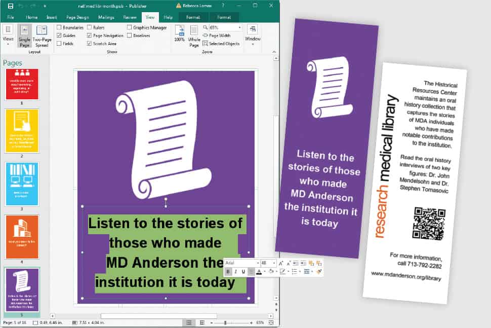
For librarians who aren’t in a position to use Canva, Wakimoto emphasizes that all of the design guidelines mentioned here can be implemented even in simpler programs such as Microsoft Publisher. “Most PCs have Publisher, and it has a much lower learning curve than Photoshop, yet you can still do a lot more design work in it than you can in Microsoft Word,” she says.
Whatever program you use, it’s important to just jump in, Phillips advises: “I can’t stress enough that people should not be afraid to dive into this. Start simple. The best way to get started is just to sit down and do it.”
 ANNE FORD is editor-at-large of American Libraries.