Digital maps provide more than directions. For the growing spatial humanities field—which combines spatial information and historical records—libraries are hubs for creative uses of geographic information system (GIS) software. One way libraries use GIS is by sharing complex information from collections and researchers through interactive and immersive maps. We talk with three librarians who are using mapping software in their academic libraries to create everything from 3D renderings to map-based timelines.
Neatline

User: Adam Strohm, director of University Archives and Special Collections, Paul V. Galvin Library, Illinois Institute of Technology in Chicago
What is Neatline? Neatline is an open source suite of plug-ins that adds geotemporal functionality to Omeka exhibits and allows users to situate exhibit items in space and time. Its SIMILE add-on provides an interactive timeline, and the Waypoints plug-in lets you define “stops” along an exhibit’s narrative journey.
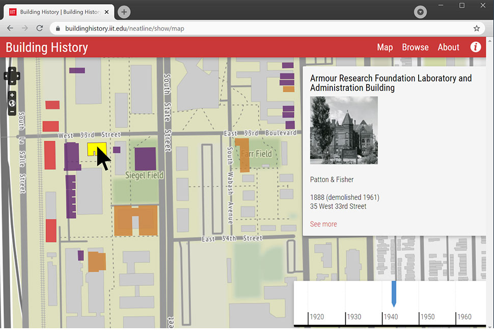
How do you use Neatline? We used Neatline to create Building History, an interactive map that tells the story of Illinois Tech’s landmark campus over the course of more than 125 years. Neatline allowed us to color-code campus and neighborhood buildings so that a user who scrolls back through time can see how they have changed. We also include a combination of modern and archival photographs to provide visual context for each structure over time. We ended up shedding light on buildings that had formerly been omitted from many of the narratives about the Illinois Tech campus.
What are the main benefits? Neatline was relatively easy to install, configure, and use, especially considering the features and flexibility it offers compared with other mapping solutions we evaluated. Neatline allowed us to illustrate how the campus began to overtake the neighborhood and transition into an almost wholly modern campus in an interactive, dynamic way.
What would you like to see improved or added to the platform? A production-ready version of Neatline for Omeka S, the newer version of Omeka, is currently in development. We’re planning to update Building History to run on Omeka S but have been putting off the migration until Neatline is ready.
ArcGIS StoryMaps

User: Nicole Kong, associate professor and GIS specialist, Libraries and School of Information Studies at Purdue University in West Lafayette, Indiana
What is StoryMaps? StoryMaps provides a user-friendly interface for anyone to create a web-based story without any coding or map construction knowledge. The system is hosted on ArcGIS Online, which offers a set of story map templates, other web map capabilities, and dashboard function.
How do you use StoryMaps? In my courses, students plan research projects and think about how to use spatial information, especially online maps, to tell stories. With StoryMaps, they have different options to customize a template based on their needs. It’s a great tool for students to explore challenging problems like environmental protection and health issues. Students can import their own research data as well as public data from government and state agencies, like the census.
What are the main benefits? It’s designed so anyone can create an online presentation of their story in just a few clicks. As an instructor, I can build a unit to get everyone started on thinking about using spatial information without additional software training. Plus, it provides a platform for users to share their maps.It used to be rather difficult to generate a customized map and even more difficult to share it online, but anyone can interact with a map that a StoryMaps user created.
What would you like to see improved or added to the platform? StoryMaps undergoes regular updates. This means it’s continuously improved, but students who learned the platform in previous years sometimes have to relearn new interfaces and new mechanisms when they return.
QGIS

User: Matthew Toro, director of maps, imagery, and geospatial services, Arizona State University Library Map and Geospatial Hub in Tempe, Arizona
What is QGIS? QGIS is a free and open source software application. It’s a complete desktop GIS software suite that has an excellent collection of 3D plug-ins.
How do you use QGIS in your library? At the Map and Geospatial Hub, we use QGIS in tandem with a range of other software applications for internal projects, workshops, and other educational offerings. Interoperability is a fundamental advantage with QGIS. We engage with 3D printing of digital surface and terrain models, and we use a QGIS plug-in to convert GIS files to 3D printer file types. We also used QGIS to create a 3D model of ASU’s campus in downtown Tempe, using building footprints extracted from light detection and ranging (LiDAR) point clouds.
What are the main benefits? Unlike some other desktop GIS software applications, QGIS is compatible with multiple operating systems (Linux, Mac, Windows). The best benefit, of course, is that it’s entirely free and its source code is open and accessible. Finding and installing third-party plug-ins is quite convenient. There’s a dedicated menu item in the software where you can find plug-ins, read ratings and reviews, and see source documentation.
What would you like to see improved or added to the platform? While QGIS can’t do everything, the beauty of the software is its ability to extend functionality with plug-ins. If there’s a feature you’d like to see added, someone has likely already developed a plug-in for it, so it’s hard to complain too much.