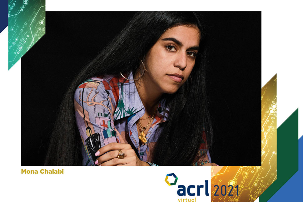
In the closing session of the Association of College and Research Libraries (ACRL) 2021 Virtual Conference on April 16, data journalist Mona Chalabi explained how she uses complex and sometimes flawed data—including the dry statistics buried in the appendix of a PDF or a government website—to visually express stories that focus on the humanity behind the numbers.
Charts all have the same visual language—lines, bars, pies—but Chalabi said she tries to marry her illustrations with their subject matter to retain her viewers’ attention. A chart about candy sales uses bars of chocolate, for example, so that the meaning is clear even if the labels are removed.
Chalabi described her two criteria for creating data visualizations (a term she prefers over infographics): clarity and beauty. As an example, she showed three charts from different sources that explain the same study, which found that white people create more air pollution than people of color do but are exposed to less. Each chart was either cluttered and confusing, or easy to read but without much information. She then showed her process for creating a two-part illustration that told the story clearly.
Another part of her process is to ask others, “Do you understand what I’m trying to say?” She said she thinks not just of visuals but about the language on the titles and labels; she looks for nouns and verbs that are inclusive, especially for people who speak English as a second language. For the air pollution graphic, she found the word inhaled had more impact than exposure.
“Time and time again you will be frustrated by the lack of data,” she noted. “That’s an opportunity to create a dataset that doesn’t exist” by using the data you have in different ways.
Chalabi said the biggest problem with most infographics is that they try to include too much information in a small space, and the eye doesn’t know where to land. One way to address this problem is through sequencing: Break down information intuitively, such as by decade (as she did on this 2018 map showing the percentage of US states’ population that is Black, 1900–2016). Thinking about your tools can help with sequencing. Chalabi often posts her data visualizations on Instagram and uses the slide feature to show information piece by piece.
Another problem with interactive data visualization is when the viewer has to do too much work. She showed an NYC.gov visualization of popular dog names in the city that required users to hover their cursors over colored circles to see each name and its rank. Chalabi took the data and illustrated the top eight names with drawings of dogs, indicating their popularity by the length of their tails.
Because data visualization often relies on users’ sight, Chalabi has been experimenting with ways to make data accessible to people with visual impairments, including creating 3D-printed versions of her illustrations and sound narration for animations. She also uses a Chrome plugin to make sure her illustrations work for people with color-blindness.
Accessibility is not a zero-sum game, she added. Whenever she has tried to make a piece more accessible for someone with a visual disability, she said, the interaction with the work increases for everyone. “It’s another reason why representation matters on teams that are creating work.”
Chalabi said she struggled to put out information about the coronavirus in early 2020 because the stakes felt so high. When designing a poster showing the common symptoms of the virus, she weighed the validity of the WHO as a source, the sample size at the time, the risks of putting out information, and worst-case scenarios. She chose to show all the symptoms in one graphic so people wouldn’t only have one part of the story. She also designed a more light-hearted illustration to explain social distancing.
“The goal is to humanize the data,” she said. “Every number represents a person.”
Welcoming first-generation students
In the on-demand session “A Place of First Resort: Designing Library Services for First-Gen Students,” researchers Isaac Gilman, dean of libraries at Pacific University in Oregon, and Xan Arch, dean of Clark Library at University of Portland, shared their work on making academic libraries more welcoming places.
The federal definition of “first-generation college student” is an individual whose parents did not complete a baccalaureate degree. But the deeper meaning of the term, Gilman said, implies the possibility that a student may lack the critical cultural capacity necessary for college success because their parents didn’t attend college. The term was originally intended to identify students whose parents were unable to prepare them for the experiences or expectations in the college environment, and first-generation students are often considered at risk of not remaining or succeeding in college.
“This deficit view of first-generation students is what we tried to explore and push back against in our research,” Gilman said. First-generation students do encounter challenges in colleges and specifically in academic libraries, but he said their research tried to identify the most common barriers that academic libraries present to first-gen students and develop recommendations that encourage libraries to improve.
Their research consisted of two phases: surveys of high school college counselors and academic librarians about anticipated barriers, and qualitative interviews with first-gen students.
Arch said one common barrier was that students may have only encountered high school or public libraries that don’t resemble academic libraries. Another challenge was the “hidden curriculum” of higher education—the implicit and explicit aspects and expectations of academic culture that may be opaque to students without a background in higher education. Examples include being unfamiliar with library terminology or not knowing if it’s okay to “bother” the librarian sitting at the reference desk. Many first-gen students’ experiences of academia and the library are shaped by their individual identities, including race, gender, and sexuality. “Higher education, including libraries, reproduces systems of oppression such as white privilege, both in the way we establish norms and expectations for students and how we deliver services,” Arch said. She pointed to recent research showing that a sense of belonging in the library can be a positive support for first-generation students.
Gilman said attitudes need to change from making sure students are college-ready to schools and libraries becoming student-ready. Their recommendations for libraries to foster first-generation student success include:
- Learning about your students’ unique identities. First-generation students are not a monolith.
- Partnering with campus offices and programs and contributing to spaces where first-generation students already are.
- Rethinking messages and use of library jargon. How easy are you making it for students to ask for help?
- Training staff and setting expectations around culturally responsive staffing. Training should address historical oppression, power differentials, and microaggressions that affect patron interactions.
“It’s on us to create an environment that’s clear, navigable, and supports students in their academic career,” Arch said.